


So, you got a new iPad and you're ready to start drawing? That's awesome! It's a great tool for making art. But, like anything new, there's a bit of a learning curve. You might hit some bumps along the way, and that's totally normal. I've seen a lot of folks, and even made some of these myself, when they first start out. Knowing about these common slip-ups can save you some headaches and help you get better faster. This article talks about 6 Common Mistakes Beginners Make in iPad Drawing, so you can avoid them.
Key Takeaways
- Always use layers to keep your artwork organized.
- Don't forget to use reference images for accuracy.
- Learn the iPad gestures to speed up your workflow.
- Pick a color palette before you start drawing.
- Play around with brush opacity for better blending.
1. Layers
Okay, let's talk layers. If you're just starting out with iPad drawing, you might be tempted to just draw everything on one layer. Trust me, that's a mistake I made plenty of times when I first started. Layers are your best friend in digital art.
Think of layers like transparent sheets of paper stacked on top of each other. You can draw on one without affecting the others. This is super useful for a bunch of reasons:
- Experimentation: You can try out different colors or effects on a new layer without messing up your original drawing.
- Organization: Keep your sketch, line art, and colors on separate layers. It makes editing so much easier.
- Flexibility: You can easily move, resize, or delete elements on their own layers.
Seriously, get comfortable with using layers. It'll save you a ton of headaches down the road. It's like having an undo button for every part of your drawing.
It's also a good idea to name your layers. "Layer 1," "Layer 2," etc., can get confusing real fast. Give them descriptive names like "Sketch," "Line Art," or "Background." You'll thank yourself later. I usually name mine after the character I'm drawing, or the element I'm working on. For example, if I'm drawing a character named Alice, I'll have layers like "Alice - Hair," "Alice - Dress," etc. It makes it so much easier to find what you're looking for.
And don't be afraid to use a lot of layers! There's no limit (well, there probably is, but you're unlikely to hit it). The more layers you use, the more control you have over your drawing. I've had drawings with over 50 layers before. It might seem like overkill, but it really helps to keep things organized. I've even heard of people using over 100 layers, but that seems a bit excessive to me. But hey, whatever works for you!
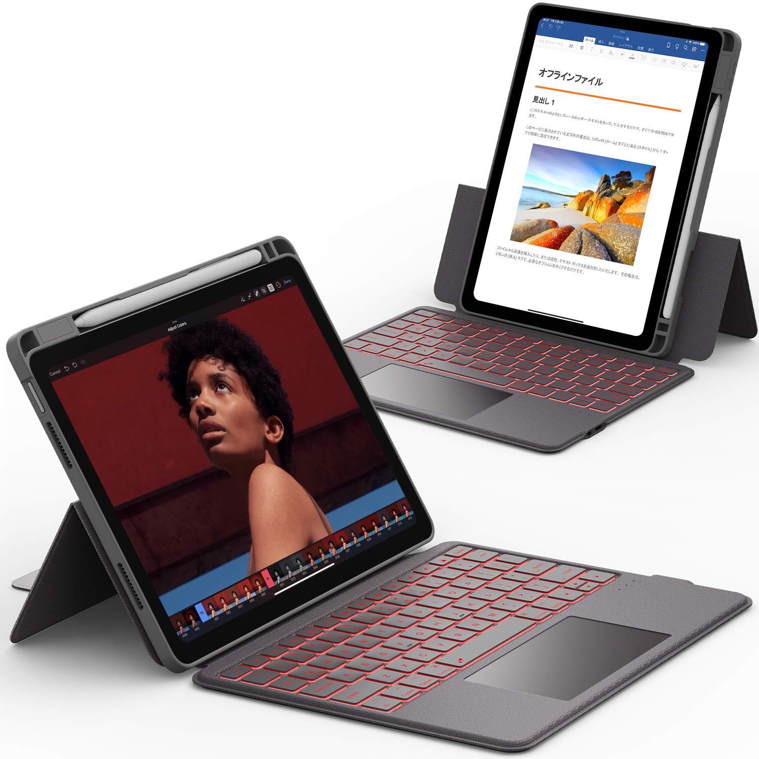
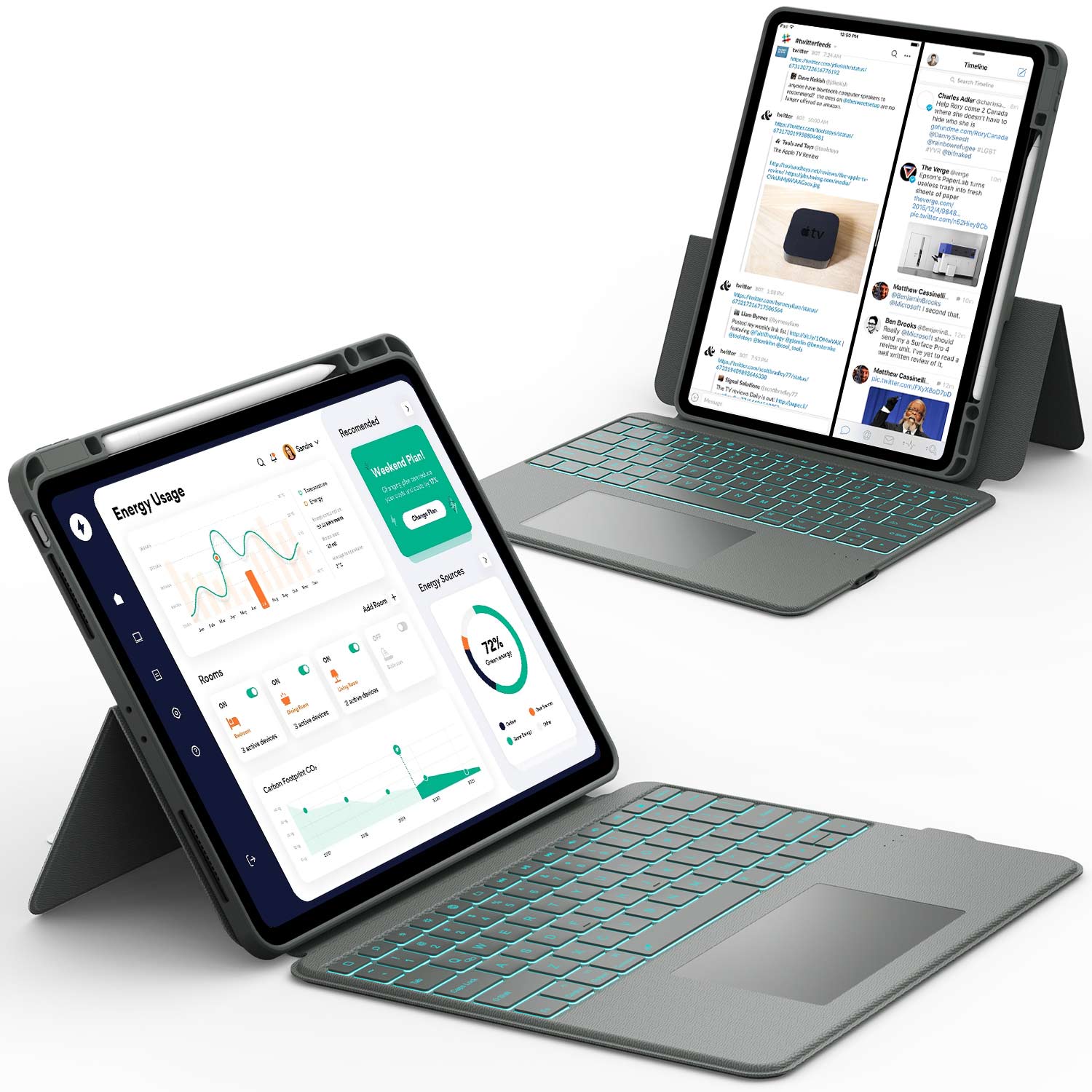
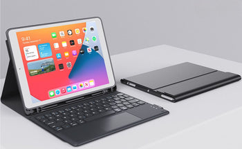
Organizing your layers is a game-changer, and so is having the right tools to streamline your workflow! The Chesona Keyboard Case for iPad combines a protective case with a responsive keyboard, perfect for jotting down notes or planning your art projects. Affordable and stylish, it’s a must-have for any digital artist.
2. Reference Images
It's easy to fall into the trap of thinking you can just pull everything from your imagination, but that's rarely the best approach, especially when you're starting out. Using reference images isn't cheating; it's learning. It's like having a teacher right there with you, guiding your hand and showing you the way.
I remember when I first started, I thought I could draw a horse from memory. It looked... well, let's just say it didn't look like a horse. It looked more like a weird dog-cow hybrid. That's when I realized the importance of references. Now, I always have a few images handy when I'm working on something new. It makes a world of difference.
Here's why you should embrace reference images:
- They help you understand anatomy and proportions.
- They provide inspiration for details and textures.
- They prevent you from making silly mistakes (like my horse-dog-cow).
Don't be afraid to use reference images. They're your friend, not your enemy. The more you use them, the better you'll become at understanding what you're drawing, and eventually, you'll need them less and less. But in the beginning, they're essential.
Think of it like this: even the most experienced artists use references. They might not need them for every single line, but they still use them to check their work and make sure everything looks right. It's all part of the process. So, grab some photos, find some illustrations, and get drawing!
3. Gestures
Okay, so gestures on the iPad are a game-changer for drawing, but it's easy to overlook them when you're just starting out. I know I did! It felt weird at first, but once you get the hang of it, it speeds up your workflow like crazy.
Here's the thing: mastering these gestures isn't just about looking like a pro; it's about making the whole process smoother and more intuitive. You'll spend less time fumbling through menus and more time actually drawing.
Here are some gestures to get you started:
- Two-finger tap: Undo
- Three-finger tap: Redo
- Pinch with five fingers: Return to the Home Screen iPad gestures
Don't underestimate the power of practice. Set aside a few minutes each day to drill these gestures until they become second nature. Trust me, your future self will thank you.
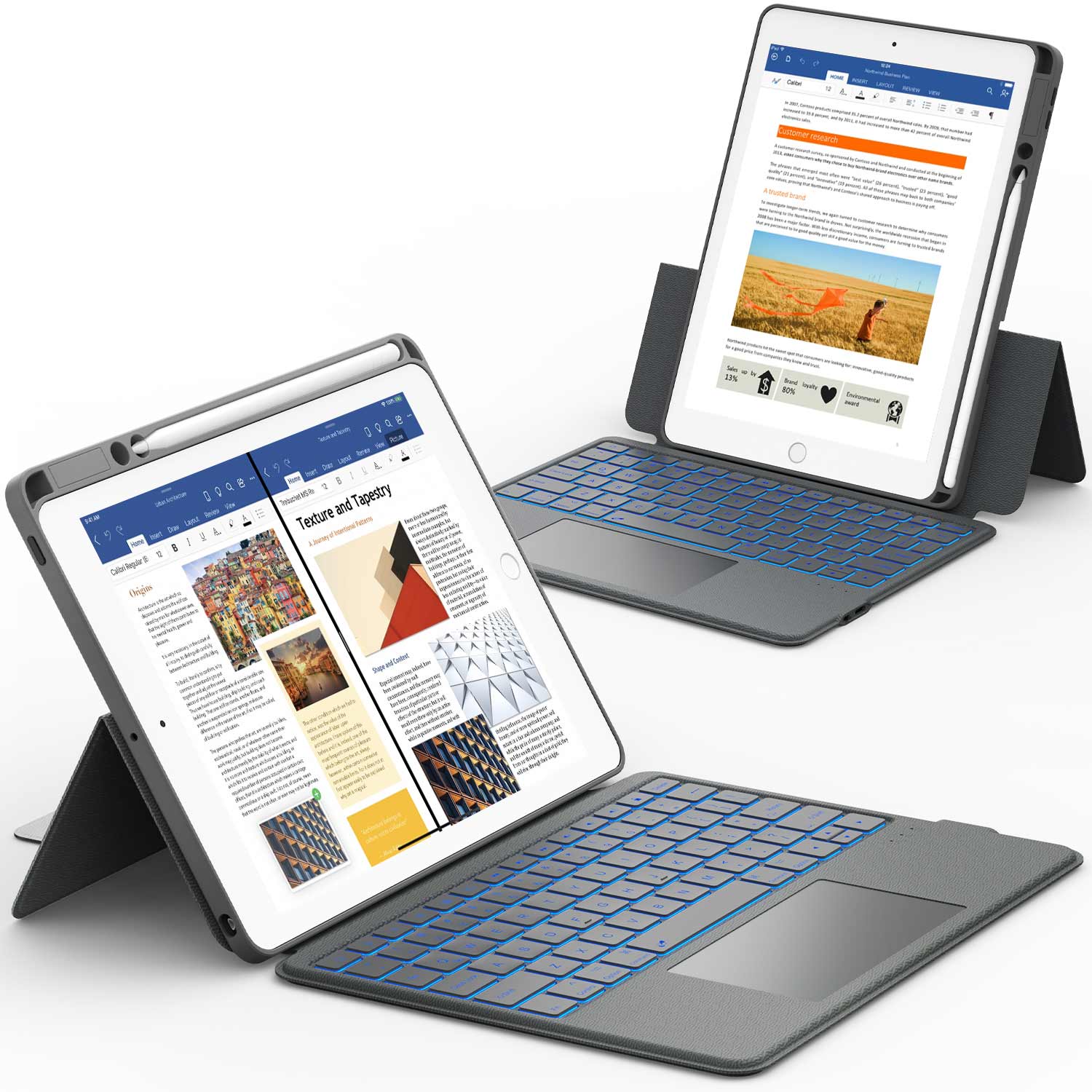
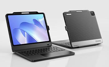
Mastering gestures makes drawing faster, but a keyboard can take your productivity even further! The Chesona Keyboard Case offers a comfortable typing experience for your iPad, ideal for writing notes or sketching ideas on the go.
4. Color Palette
It's easy to just start slapping colors onto your canvas, but trust me, a little planning goes a long way. I used to just pick whatever looked good at the moment, and my drawings ended up looking like a chaotic mess. Now, I spend a bit of time setting up a color palette beforehand, and it makes a huge difference.
- Start with a limited palette: It's tempting to use every color under the sun, but limiting yourself to a few key colors can create a more cohesive and visually appealing piece. Think about the mood you're trying to create and choose colors that reflect that.
- Experiment with color combinations: Don't be afraid to try out different combinations to see what works. There are tons of resources online that can help you find complementary colors or create a specific color scheme.
- Save your palettes: Once you find a palette you like, save it! Most drawing apps let you create custom palettes, so you can easily access your favorite colors for future projects.
I find that using a color palette helps me stay focused and prevents me from getting overwhelmed by too many choices. It's like having a roadmap for your colors, guiding you through the drawing process.
Here's a simple example of how different palettes can affect the mood of your artwork:
| Palette Name | Colors | Mood |
|---|---|---|
| Warm | Red, Orange, Yellow | Energetic |
| Cool | Blue, Green, Purple | Calm |
| Neutral | Gray, Beige, White, Black | Sophisticated |
| Monochromatic | Different shades of the same color | Unified |
So, before you start your next iPad drawing, take a few minutes to set up a color palette. It'll save you time and frustration in the long run, and your artwork will look much more polished.
5. Brush Opacity
One thing I see a lot of new iPad artists struggle with is brush opacity. It's easy to just pick a brush and start drawing, but you're missing out on a lot of control and subtlety if you ignore the opacity setting. Using the same opacity for everything can make your art look flat and lifeless.
Think of it like this: if you're painting with real watercolors, you wouldn't just slap down thick, opaque layers of paint, right? You'd build up the color gradually, using thin washes to create depth and dimension. The same principle applies to digital art.
Here's why playing with opacity is so important:
- Smooth Shading: Lowering the opacity allows you to build up shadows and highlights gradually, creating smooth transitions between light and dark areas.
- Blending Colors: Overlapping strokes with low opacity can help you blend colors seamlessly, creating soft gradients and subtle color variations.
- Adding Texture: Varying the opacity of your brush can add texture and visual interest to your artwork. Try using a textured brush with low opacity to create a subtle, grainy effect.
Don't be afraid to experiment with different opacity settings to see what works best for you. There's no right or wrong answer, and the best way to learn is to play around and see what happens. You might be surprised at the results you can achieve!
It's like discovering a whole new world of possibilities when you start to really understand how opacity works. So, take some time to explore the opacity settings in your favorite drawing app, and see how it can improve your art.
6. Canvas
It's easy to overlook the canvas itself when you're first starting out with digital art on the iPad. You're probably excited to jump right in and start drawing, but taking a moment to think about your canvas can save you a lot of headaches later on. Trust me, I've been there!
Wrong Size
One of the most common mistakes is choosing the wrong canvas size. Starting with a canvas that's too small or has a low resolution can really limit you. Imagine drawing this amazing piece, and then when you try to print it or share it online, it looks all pixelated and blurry. Not fun, right?
- Always start with a high resolution (300 DPI is a good rule of thumb).
- Think about the final size you want your artwork to be.
- It's better to have a canvas that's too big than too small.
I remember one time I was working on a project and didn't think about the canvas size. I drew this whole illustration, and it looked great on my iPad. But when I tried to use it for a poster, it was a blurry mess. I had to redo the whole thing! Lesson learned.
Overcrowding
Another thing to watch out for is overcrowding your canvas. It's tempting to fill every inch with details, but sometimes less is more. A cluttered canvas can be overwhelming and make it hard for the viewer to focus on the main subject.
- Plan your composition before you start drawing.
- Use thumbnails to experiment with different layouts.
- Leave some empty space to give your artwork room to breathe.
Not Flipping the Canvas
This is a trick that a lot of beginners don't know about, but it can make a huge difference. Flipping your canvas horizontally allows you to see your artwork with fresh eyes. It can help you spot mistakes in proportion, perspective, and composition that you might not have noticed otherwise. Most art programs have a simple "flip horizontal" option in the edit menu. Give it a try!
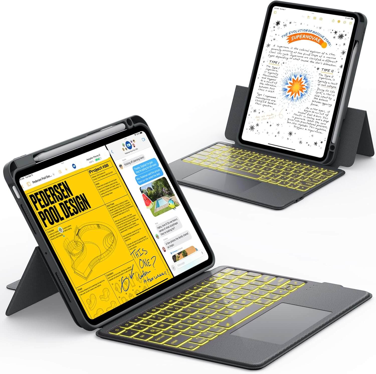
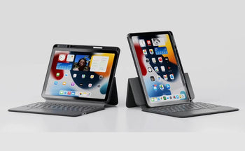
Boost your iPad art workflow with the Chesona Tablet Keyboard. Affordable and designed for iPad, it’s great for organizing your projects.
Wrapping It Up
So, there you have it. Drawing on an iPad is a lot of fun, but it's easy to trip up when you're just starting. We all make mistakes, that's just how it goes. The good news is, once you know what to look out for, it's pretty simple to get better. Just keep at it, try new things, and don't be afraid to mess up a little. You'll get the hang of it, and your art will look great.
Frequently Asked Questions
What are layers in digital drawing?
Layers are like clear sheets you stack on top of each other to build your drawing. Each sheet can hold a different part of your art, like the lines, colors, or background. This way, you can change one part without messing up the others.
Why should I use reference images?
Reference images are pictures you look at while you draw to help you get things right. They can be photos of people, animals, objects, or even other artworks. They help you with shapes, colors, and details.
What are gestures on an iPad?
Gestures are quick finger movements on your iPad screen that do things like undo a mistake, zoom in, or switch tools. Learning them makes drawing much faster because you don't have to tap buttons all the time.
What is a color palette?
A color palette is a set of colors you choose to use for your drawing. It helps make sure all your colors look good together and give your artwork a consistent feel. Think of it as picking out clothes that match before you get dressed.
What does brush opacity mean?
Brush opacity controls how see-through your brush strokes are. If it's at 100%, your color is solid. If it's lower, your color will be lighter and more transparent, which is great for blending and soft shading.
What is a canvas in digital art?
The canvas is your drawing area, like a blank piece of paper. Setting it up right means choosing the best size and quality for your artwork, especially if you plan to print it later.